Healthcare / Mobile App
DocEase
Your Health, Your Schedule
Client
Academic Project
Duration
Concept Case Study
Role
UX/UI Designer
Deliverables
User Research & Interviews, User Persona
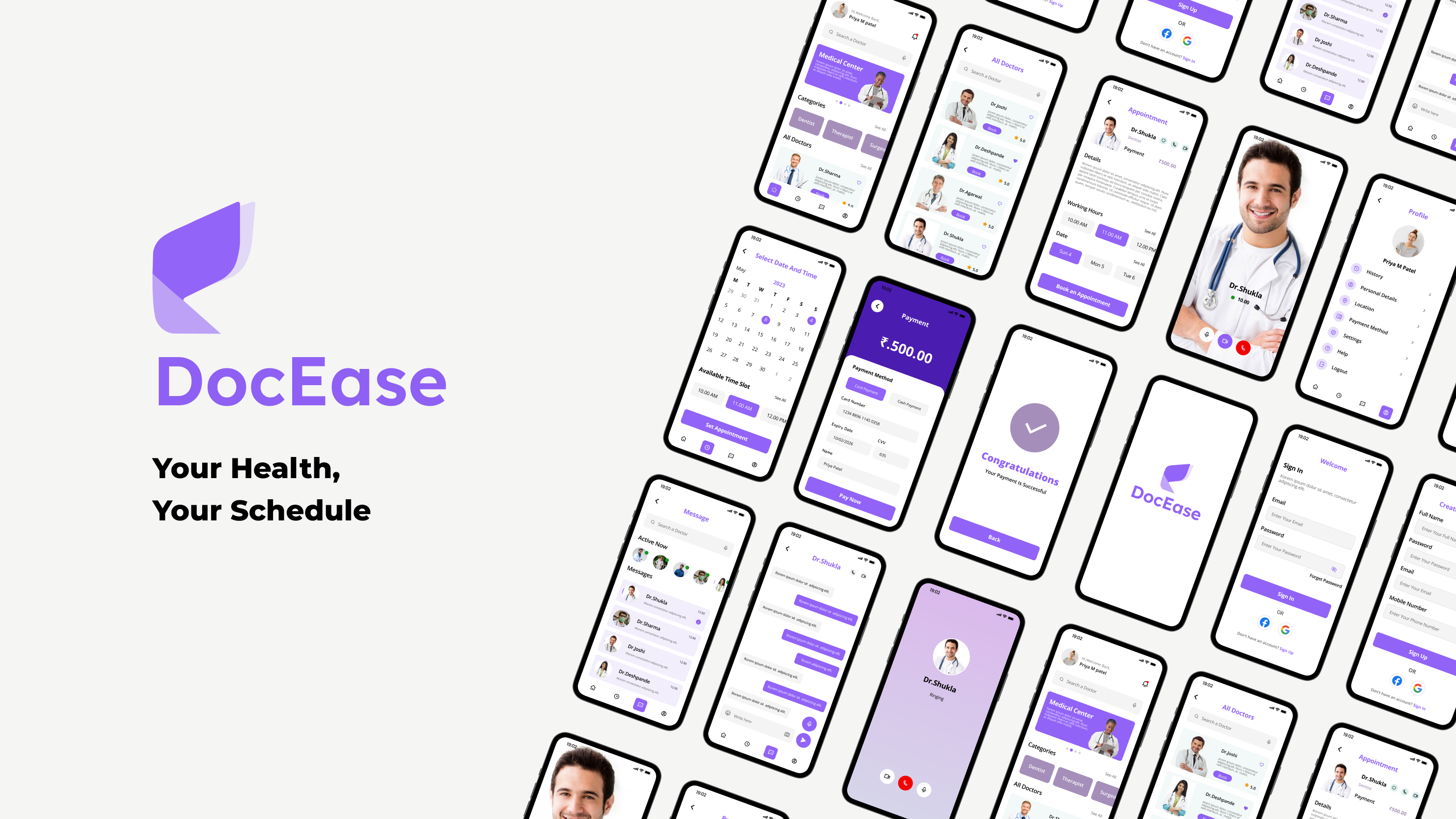
DocEase: Healthcare Simplified
Project Overview
"Your Health, Your Schedule." DocEase is a mobile application designed to simplify the doctor appointment process, aiming to reduce waiting times and streamline healthcare access for patients.
The Goal:To emphasize user needs and bridge the gap between patients and doctors through a transparent, efficient digital booking system.
The Design Process
Methodology
I followed a structured User-Centered Design process to ensure the solution was grounded in real user needs.
1. Empathize:Conducted User Interviews and Surveys to understand the core frustrations of patients.
2. Define:Synthesized findings into User Journey Maps, Goal Statements, and Empathy Maps.
3. Ideate:Generated solutions through Brainstorming, Card Sorting, and User Flows.
4. Design:Created Lo-fi Wireframes, defined the Style Guide, and built High-fidelity Prototypes.
User Research & Analysis
Key Pain Points
Research revealed four major friction points in the traditional healthcare experience:
Long Waiting Times:Patients spend excessive time waiting on the phone to book, and even longer in clinic waiting rooms.
Information Gap:Limited access to comprehensive doctor details, specialties, and real-time availability.
Rigid Scheduling:Difficulty in rescheduling or canceling appointments leads to frustration.
Payment Friction:Inconvenient payment processes at the clinic add to the stress of the visit.
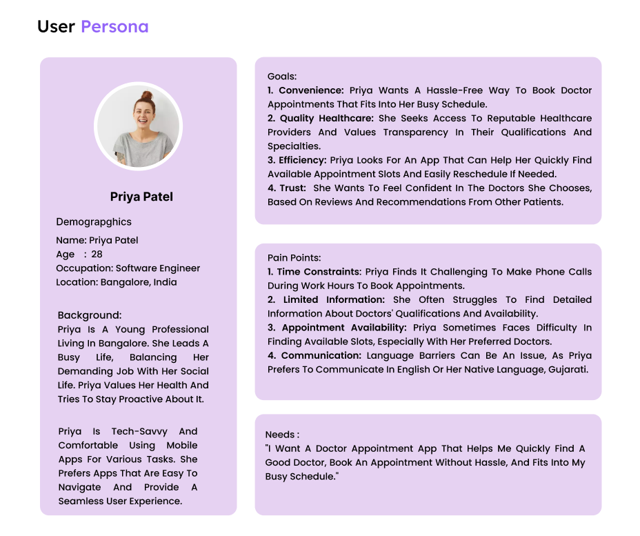
User Persona: Priya Patel
A working professional who values efficiency and trust.
Goals:Needs a quick way to find trusted specialists and book appointments without phone calls.
Frustrations:Hates long wait times and the lack of transparency in doctor schedules.
The Solution
Key Features
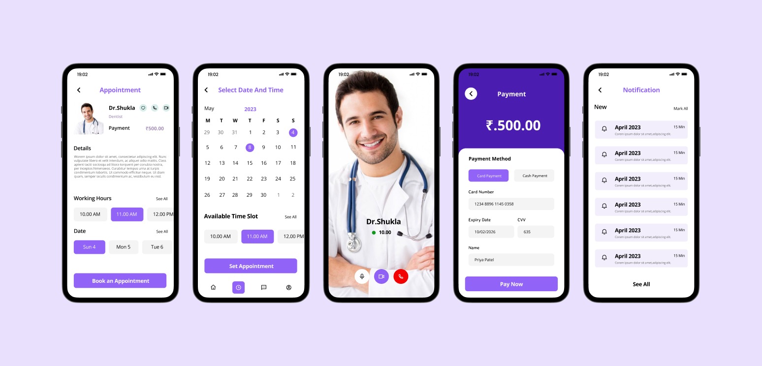
Smart Booking System:A streamlined flow allowing users to browse doctors by specialty and book instantly.
Comprehensive Profiles:Detailed doctor profiles including experience, fees, and patient reviews.
Flexible Management:One-tap rescheduling and cancellation options to give users control.
Integrated Payments:Secure in-app payment gateway to handle consultation fees before the visit.
Visual Design System
Style Guide
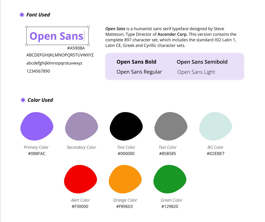
Typography:Open Sans was chosen for its neutrality and excellent legibility across mobile screens.
Color Palette:A primary palette of Teal (#008080) and White to evoke cleanliness, calm, and medical trust.
Interface:Clean, card-based layouts ensure information is digestible and the app is accessible to all age groups.